
Neutral colour palettes have been prevalent in all aspects of design for several years. Colour trends for 2024, bring balanced colours to the forefront with soft pinks, soothing blues, and deep nature tones.
The resurgence of these soothing and deep colours is a way for people to feel balanced. Colour is still present, but we are more grounded – a timely direction especially given anticipated political, economic, and social uncertainty.
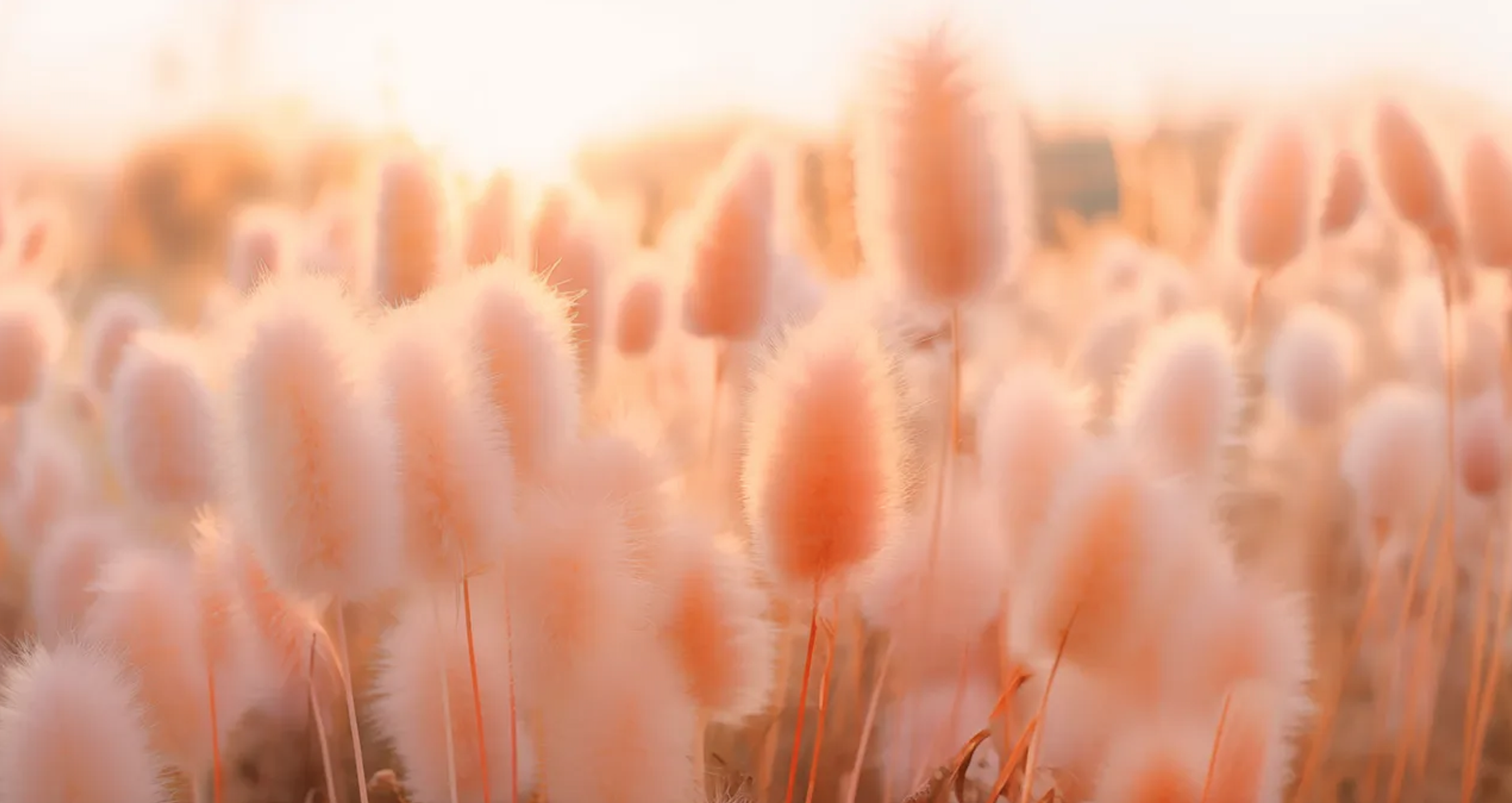
Pantone’s Colour of the Year is the soft Peach Fuzz. This uplifting, welcoming peach is far more tranquil than the vibrant colours we saw dominate last year.
Fashion and design are pulling many references from nature, including ocean blues, forest greens, and warm, earthy tones.
Elegant pinks did not end with Barbie in 2023. Instead we see warm pinks paired with breezy blues to create a comforting pairing.
Benjamin Moore’s colour of the year is Blue Nova 825. Like Peach Fuzz, it is also soft and comforting.
Let’s take a look at my top colour trends for SS24!
#1 Peach Fuzz Fizz

This palette highlights the Pantone 2024 colour of the year in a big way. Try using it in the logo, for headlines, as backgrounds, and for calls-to-action. Play on the softness with a bright, warm accent, or pair it with a richer pink.
#2 Tropical Sunset

In this colour palette, we’re walking closely alongside the Pantone Colour of the Year, but adding more mature tones.
#3 Lavender Haze

This palette would be great for anyone working in the newborn or child space (such as baby brands, photographers or paediatric sleep coaches). While the colours are reminiscent of a nursery, they incorporate the sweet purples and soft greens of nature.
#4 Super Nova

This colour palette incorporates Benjamin Moore’s Blue Nova 825. This starry blue and a soft sky blue are great as the primary colours in the brand, and then offset with two light neutrals. A rustic orange stands out as an accent. Ground it with a lot of white to keep the colours from feeling too strong.
#5 Spring Forward

With its golden yellow, pale green, and rich emerald tones, this palette feels like springtime in Ireland. The pale green is soft and on-trend with what we’re seeing this year, but it’s balanced out with a deep emerald green and neutral creams.
#6 Perfectly Picturesque

With its various pink tones and soothing lavender, this palette feels very feminine. We added a butter-soft yellow for the neutral and paired it with a fun turquoise accent.
#7 Loving You

This palette incorporates colours we saw throughout 2023, but the soft pink and dark red bring a bit more balance. It reminds me of spices (saffron, chili powder, paprika, etc). If you wanted to tone it down a bit, you could make the bright red your accent and bring in a lighter shade of one of the primary colours as the other neutral.
#8 Palm Beach

These colours have a classy but tropical appeal. The base of the palette is made up of soft greens and a rosy pink serves as the accent. The neutrals of this palette enhance its warmth, keeping on trend with 2024.
#9 Sherwin Oaks

This colour palette features Sherwin Williams’ Upward as the primary colour. Pairing this delicate blue with a deeper blue allows the eyes to rest. Both neutrals are a soft cream, and the accent gives a flash of warmth.
#10 Spring’s Song

This palette was inspired by fresh, springtime flowers. It pairs a soft lavender and fresh green with neutral pastels and a tangerine accent.
If you would like to try one of these fab colour palettes for your brand or website, get in touch and let us help you bring it to life!

View comments
+ Leave a comment